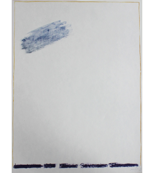
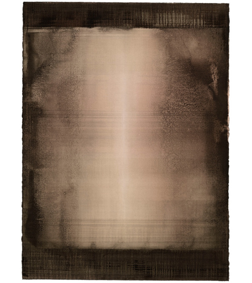
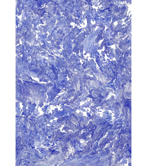
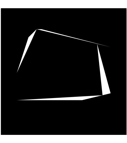
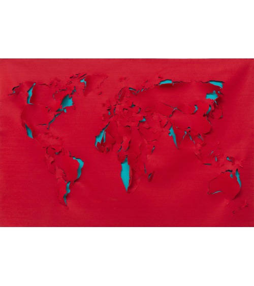
Marine maps from the early twentieth century are the backdrop for a triptych inhabited by signs and diverse highlights. Original intervention by the artist on each piece of the series.
Ever since the 80’s, Philippe Favier has been working on his particular universe that has no equivalent in contemporary art. Collages, paintings, photographs and etchings are among the domains he chooses to explore.
Starting off with ancient objects or documents he collects in fairs and flea markets, he unrolls a dreamlike world that re-establishes the codes of representation.
The edition he has just created for Bernard Chauveau Publishing and Le Néant Publishing is exemplary. Marine maps from the early twentieth century are the backdrop for a triptych inhabited by signs and diverse highlights.
In each part, the pattern is hidden, annihilated by black paint that allows several effects of texture to appear here and there. Even if the margins let certain signs appear, even if a few islands are still apparent, Philippe Favier disturbs the ensemble by adding elements that are both pictorial (a monumental “O” in white gouache marks the work) and that resemble miniscule objects (metallic flowers, golden chains and painted texts).
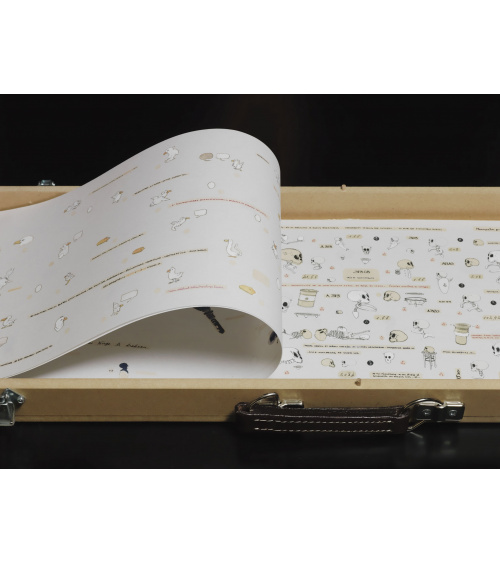
There are eight copies of this triptych, each one is unique, since Philippe Favier decided to intervene directly on each element of the series. The artist admits that The O Islands has marked a turning point in his studies of occidental typography, which for over six centuries has represented the way we represent the world.
Data sheet
Marine maps from the early twentieth century are the backdrop for a triptych inhabited by signs and diverse highlights. Original intervention by the artist on each piece of the series.